

x-decks
year(s): 2021-2025Identity Designx-decks is a leading name in the playing card community, connecting collectors, creators, magicians and cardists through products, collaborations and events.
scroll to read more ↓Last Updated 09/2026[ Objective ]Positioning X-Decks as more than a playing card retailer, creating a distinctive brand identity that sits at the intersection of craftsmanship and artistry.
[ Context ]More THan just 52 Cards
For collectors, magicians, cardists and anyone who has fallen down the playing card rabbit hole, x-decks is much more than a shop.
With more than 2,500 playing card products across its catalogue and hundreds of Kickstarter projects supported, the brand has built a unique position within the community. It works closely with artists, designers, magicians and cardists, while producing its own decks and expanding into games, collectibles and other creative projects.
That involvement extends beyond products. x-decks shows up across the community, from Instagram and Discord to conventions, fairs and events, while supporting everything from independent artists and Kickstarter campaigns to documentaries and larger creative projects.
The brand has also built a reputation for pushing beyond what is expected from playing cards. From unusual deck concepts to packaging that becomes part of the experience, x-decks keeps exploring what can be done when craftsmanship and creativity are given room to play.
The challenge was to capture all of that in one identity without making x-decks feel like just another premium card company.
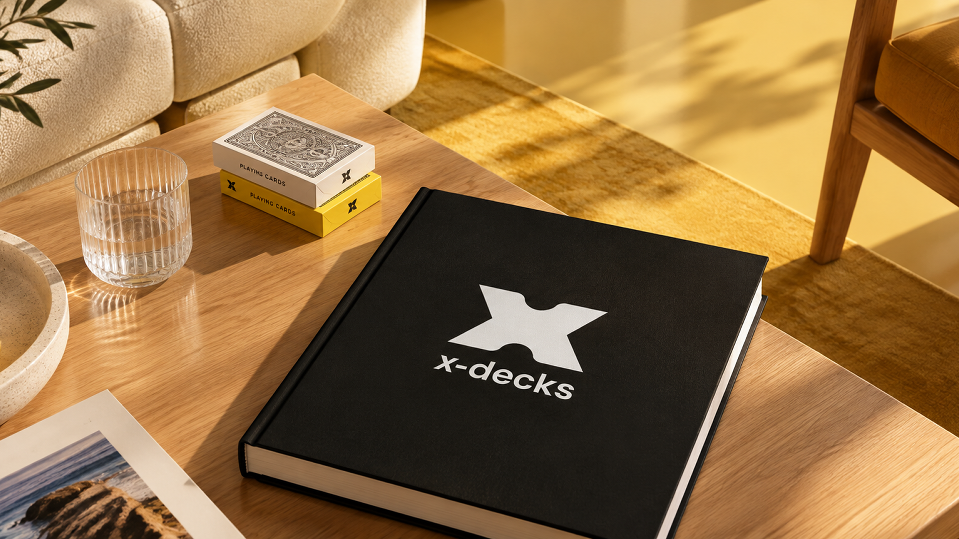



“I want to introduce the world to the beautiful artform of cards.”

[ Design ]The Intersection of Craft & Artistry
The identity needed to feel modern and distinctive without losing the warmth that makes x-decks approachable.
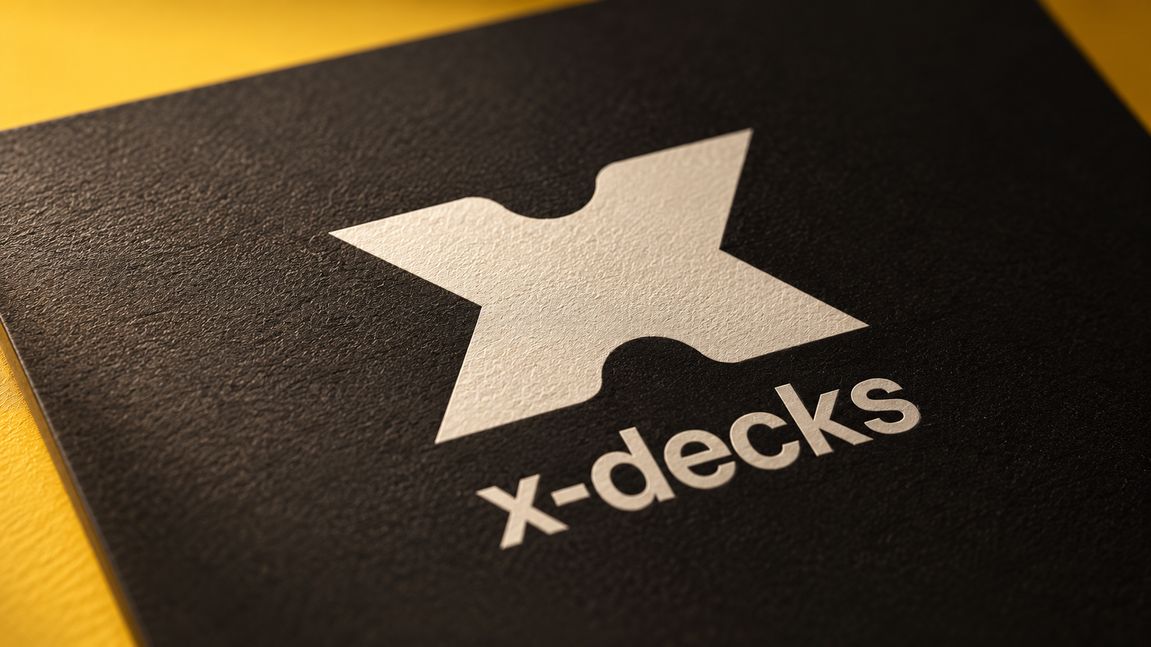
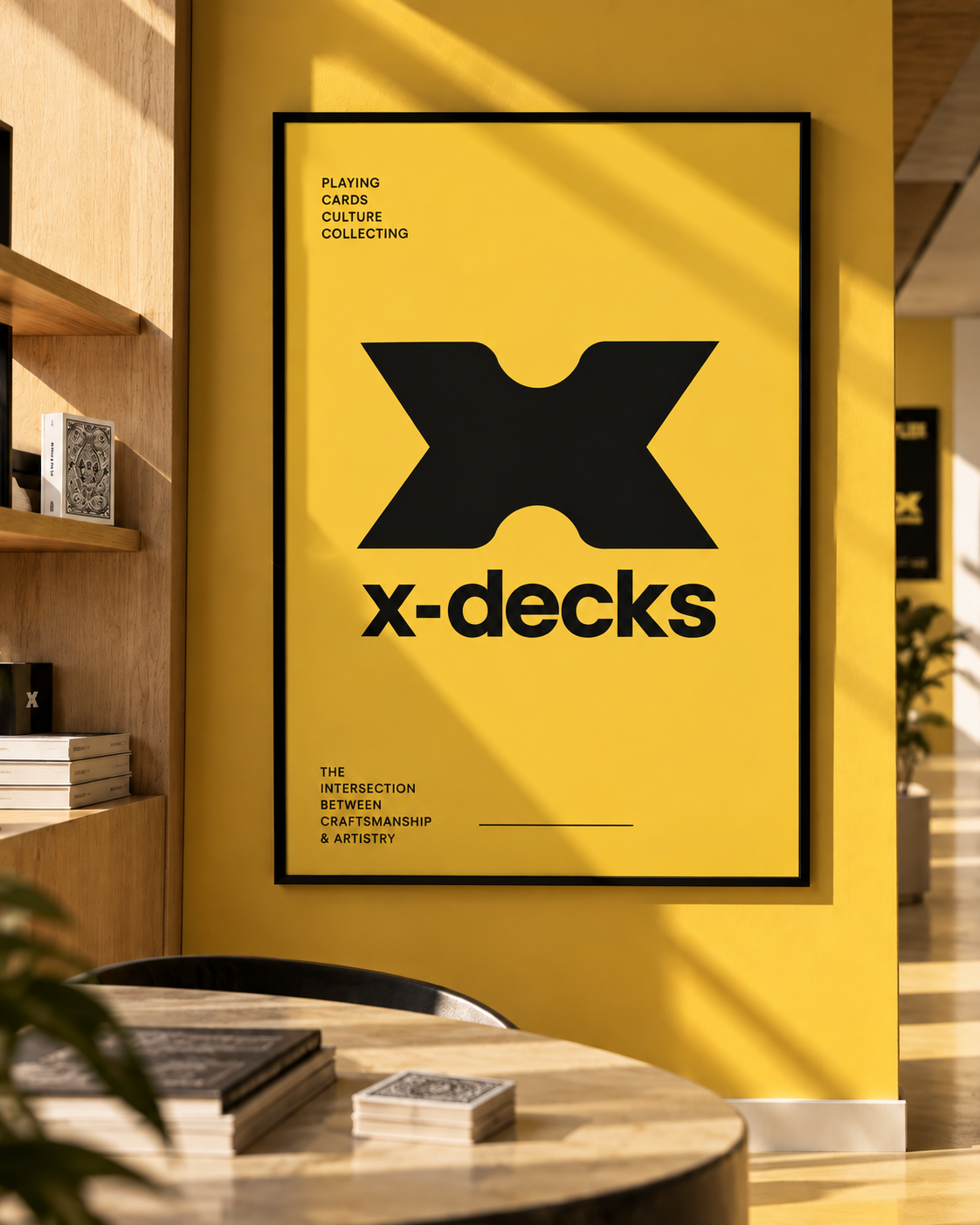
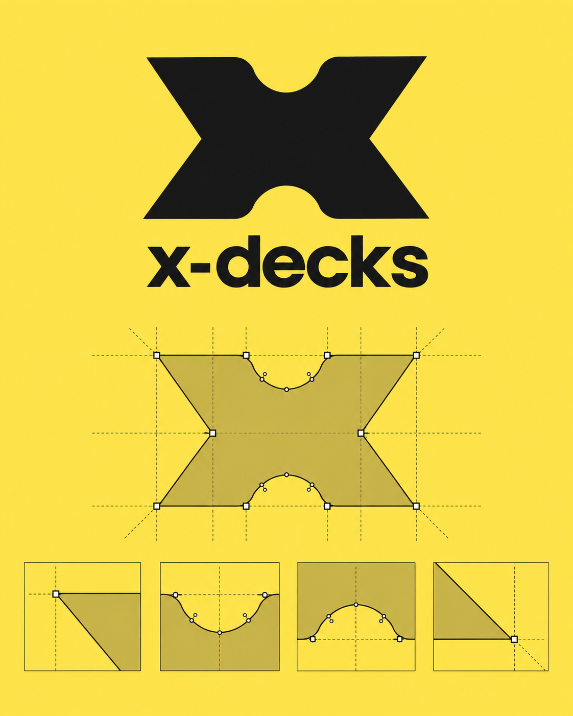
At the centre is a bold X icon, combining rounded and sharp corners to balance precision with personality. The geometry reflects the two sides of x-decks: craftsmanship and artistry, structure and experimentation.
The wordmark stays lowercase to keep the brand feeling inviting rather than corporate. Together, the logo and typography create an identity that can move between a website, a deck of cards, a convention booth or an entirely new product.
The color system follows the same thinking. Instead of relying on the high-contrast combinations often seen in the playing card world, we introduced a warm, bright yellow as the brand's signature color, supported by softer off-whites, greys and blacks.
Yellow brings energy and optimism to the identity while giving x-decks a recognisable presence across digital and physical touchpoints.
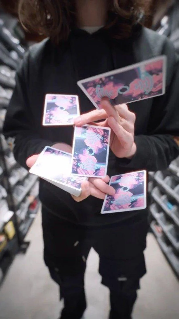
[ Shortform ]Approach ↘I developed social-first content that brings the personality behind x-decks and its products to life. Fast pacing, close-up product shots and playful editing turn new releases, collaborations and unusual designs into content that feels native to the card community.
[ ProductS ]From Brand to Product
The identity didn't stop at the brand itself. I also worked directly on products for x-decks, turning the visual language into physical decks that could live within the community.
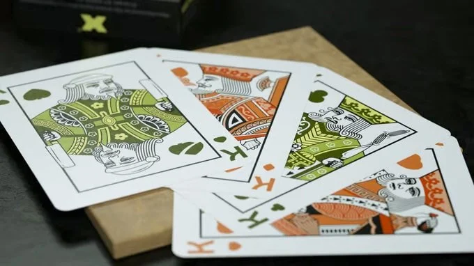
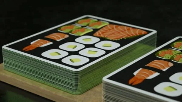
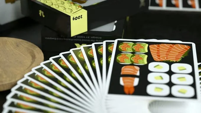
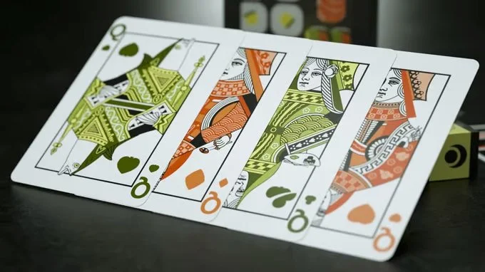
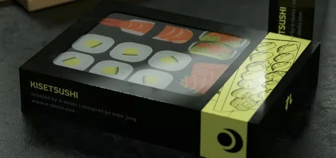
From the Japanese-inspired Tsukuyomi deck to the Lofi Mix Vol. 1 and Kisetsushi playing cards, each project explored a different visual world while staying connected to the wider x-decks universe.
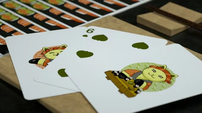
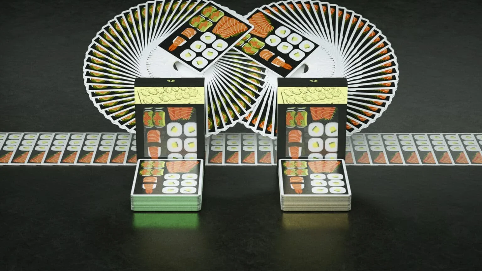
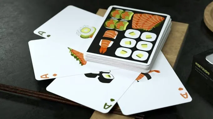
Tsukuyomi became the first deck in the Kisetsu Cards family, combining custom colours, modified courts and references to Shinto mythology and anime. Lofi Mix reimagined the traditional deck through lo-fi music culture, with customised courts, neon-inspired pips and a Walkman-inspired tuck box. Kisetsushi took the concept even further, turning the deck into a miniature sushi experience through custom courts and a tuck box designed like a bento box.
Working across the cards, packaging and visual details meant the design could be experienced rather than simply seen. Each deck became its own small world, while still feeling part of the x-decks family.
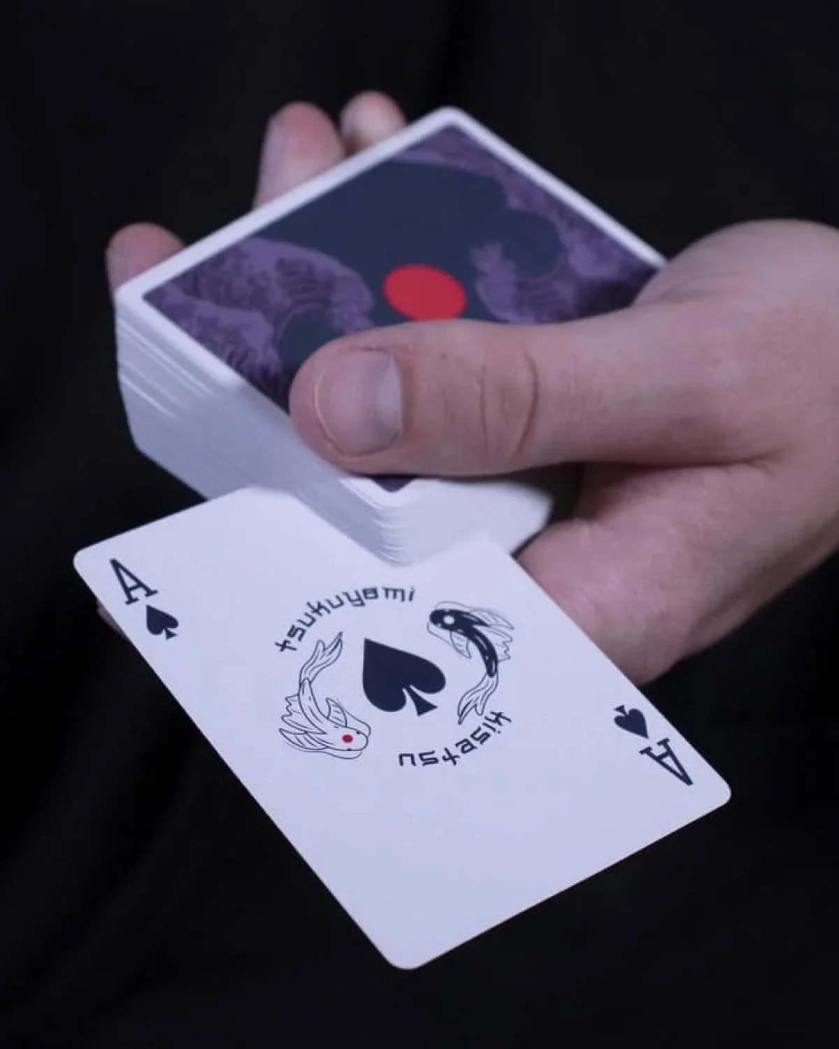
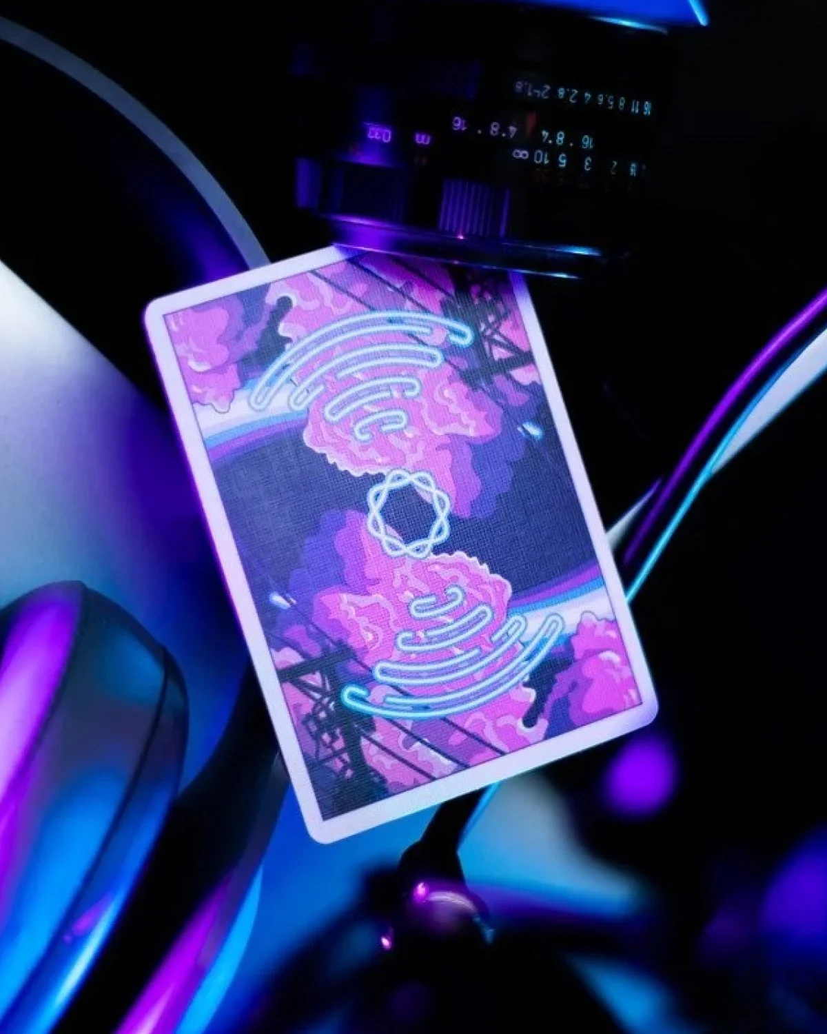
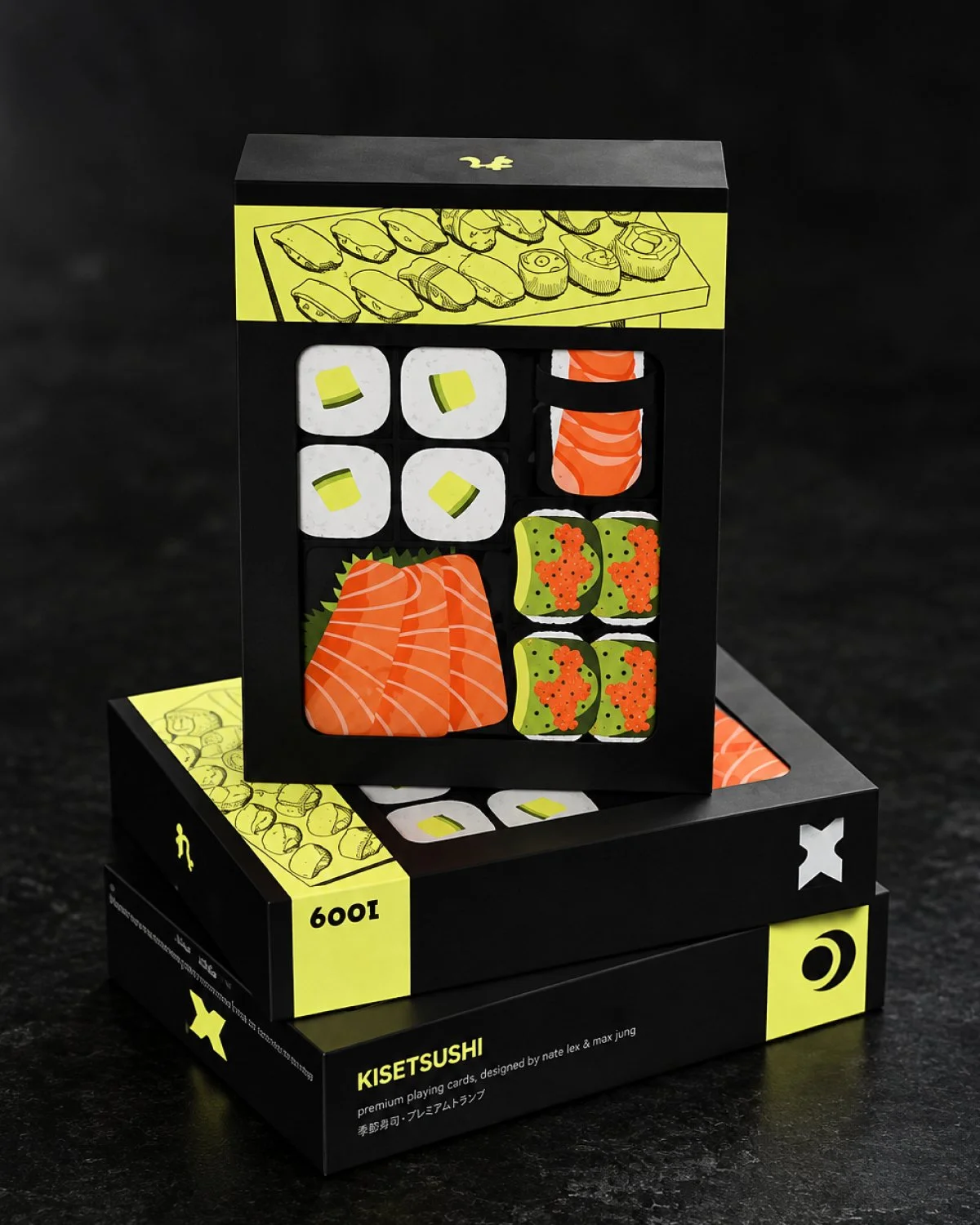
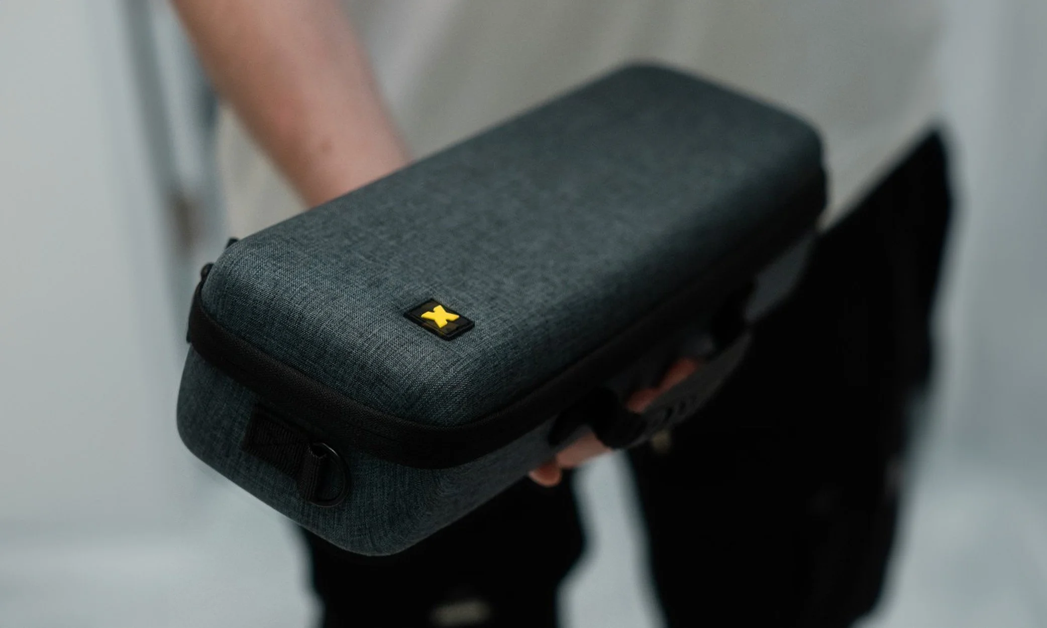
[ Photography ]Approach ↘Photography focused on the tactile side of the products, highlighting materials, textures, finishes and small details through clean compositions and considered lighting.


[ KEY INSIGHT ]
Keep Pushing the BoundARIES
x-decks has never really been about doing things the obvious way.
Whether it is a new deck, an unusual package, a game, a Kickstarter project or a collaboration with an artist, the instinct is always to ask what else could be possible.
That became a key part of the identity. Rather than making x-decks look like another premium playing card company, the system needed to communicate curiosity, experimentation and a willingness to try something that has not been done before.
The result is a brand that can stretch with the community around it, from traditional playing cards to completely unexpected ideas.

[ Squad ]x-decks
Max Jung
Client
Design